New Zealand
 Australia
 United States
 United Kingdom
 Ireland
Colour Psychology in Interior Design
How Colour Shapes the Way We Feel, Think, and Work
Colour is one of the most powerful tools available to architects and designers. Beyond aesthetics, it shapes how people experience a space, influencing mood, behaviour, perception, and even how easily they navigate an environment.
What is Colour Psychology?
Colour psychology explores the relationship between colour and human behaviour. While often referenced in design, it is important to recognise that colour psychology is not an exact science. People’s responses to colour are influenced by personal experiences, cultural backgrounds, age, and context.
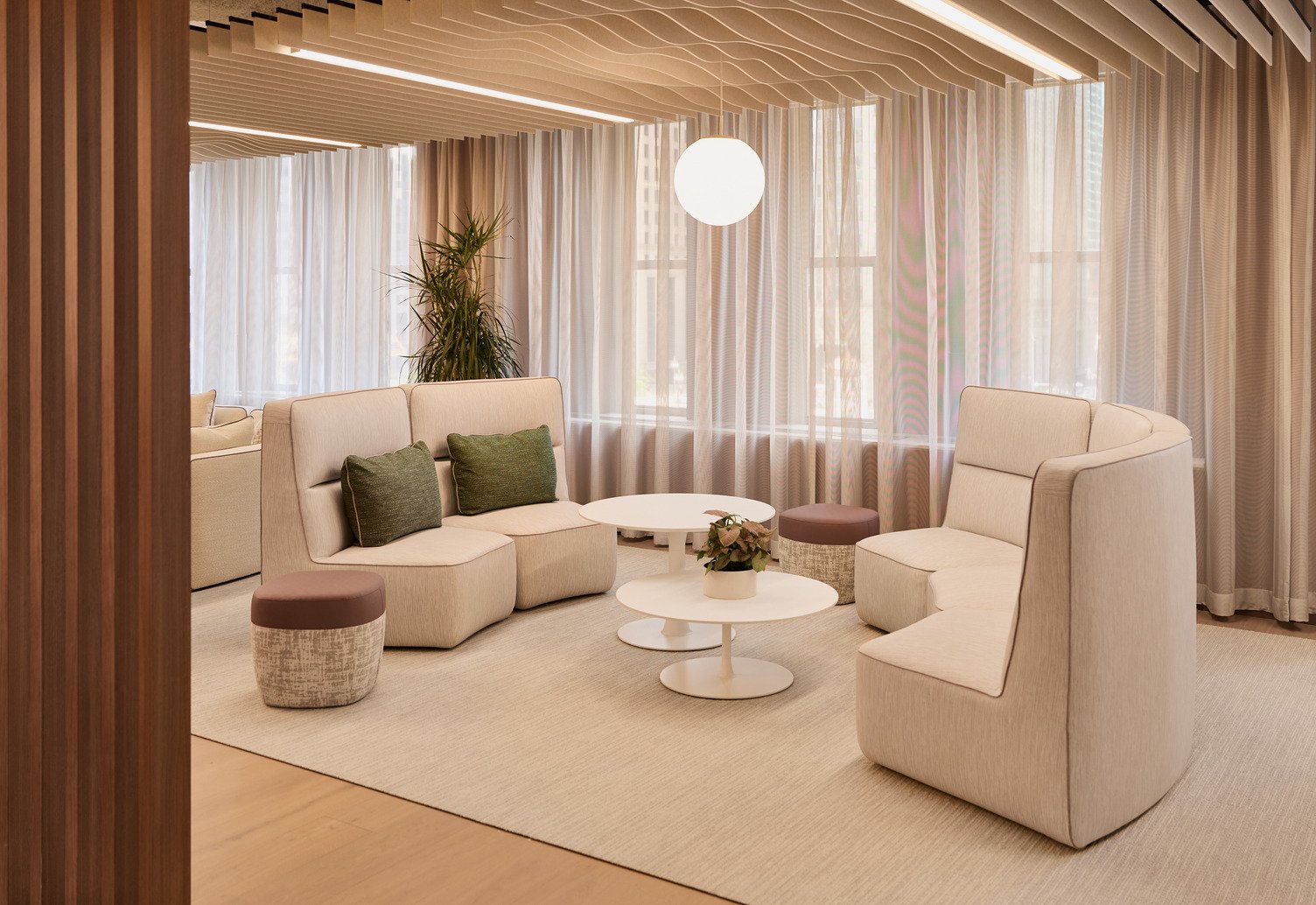
Despite these variations, many colours tend to evoke common emotional associations. Blues are frequently linked with calm and trust, greens with nature and restoration, reds with energy and stimulation, and neutrals with balance and sophistication. Research suggests that colour can influence mood, productivity, and our perception of a space, making it a valuable consideration in interior design.
For this reason, designers often use colour intentionally to support specific outcomes, helping create environments that feel focused, collaborative, welcoming, or restorative depending on the needs of the occupants.
How Colour Impacts Interior Spaces
Mood and Emotional Response
Colour can help shape the emotional character of a space. Cooler tones generally contribute to a sense of calm, while warmer colours often create feelings of energy, warmth, and activity.
Perceived Space and Scale
Colour also affects how we perceive size and proportion. Lighter colours tend to make spaces feel more open and expansive, while darker tones create intimacy, enclosure, and focus.
Comfort and Focus
The right palette can support concentration, reduce visual fatigue, and contribute to overall comfort. Colour works alongside lighting, acoustics, materials, and layout to influence how people feel and perform within a space.
Social Interaction
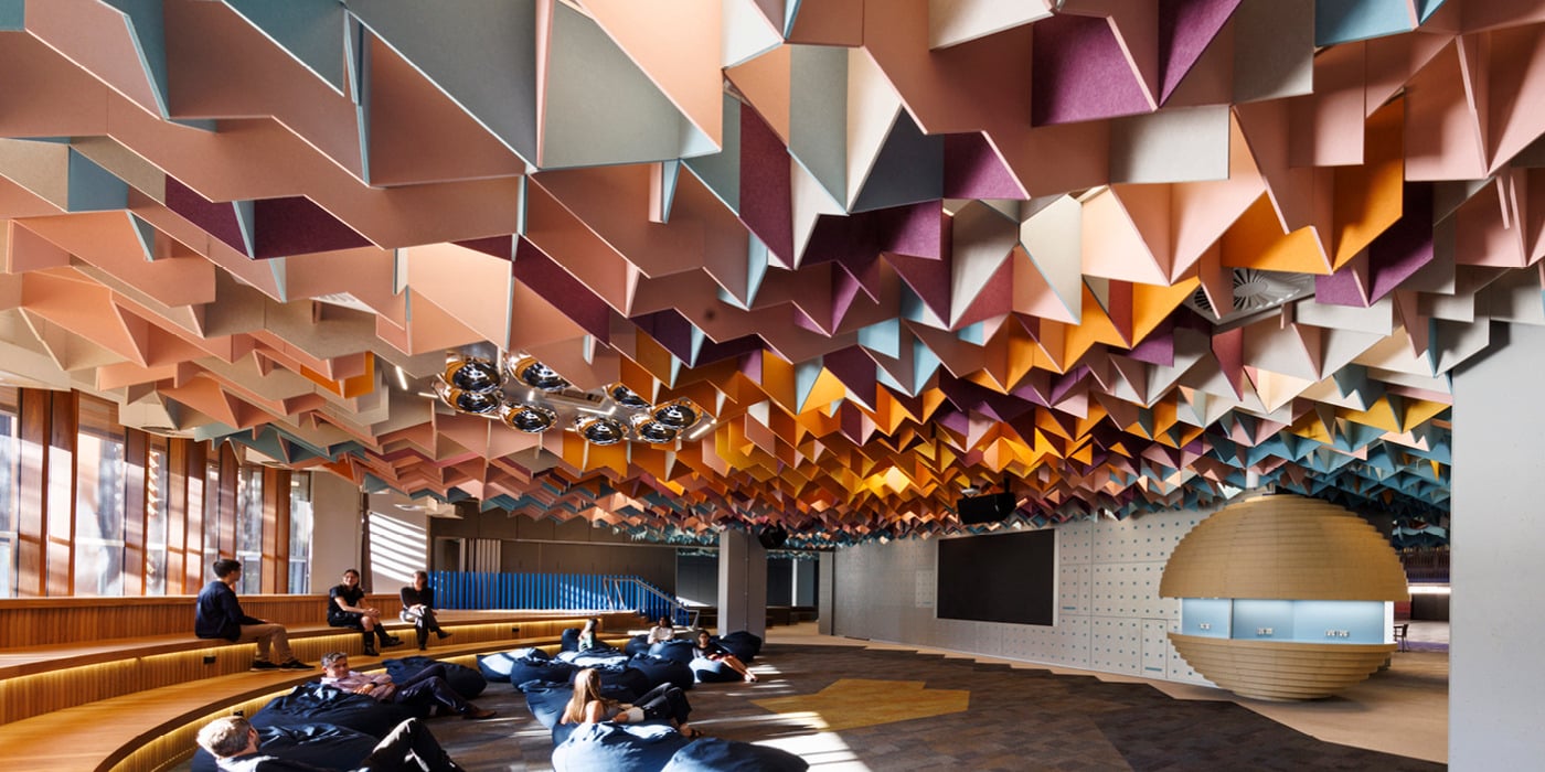
Colour can subtly encourage different behaviours. Warm, vibrant hues often support sociability and engagement, while cooler palettes can help create quieter, more reflective environments.
Wayfinding and Zoning
In larger environments, colour is frequently used to define zones, differentiate functions, and support intuitive navigation. Educational campuses, workplaces, and healthcare facilities often use colour to help users orient themselves and move confidently through a space.
Common Colour Families and Their Applications
In office environments, blues, greens, and layered neutrals often balance focus with comfort. Meeting rooms and boardrooms frequently feature deeper, more grounded tones that promote professionalism and concentration. What can be impactful in these spaces is to balance cool and warm tones to help prevent cognitive fatigue.
Education spaces often benefit from a considered mix of energising and calming colours. Vibrant accents can support engagement and creativity, while softer tones help reduce overstimulation.
Healthcare environments commonly draw on calming greens, blues, and nature-inspired palettes to create spaces that feel reassuring, restorative, and easy to navigate.
While colour can have an impact on functionality, it also plays a crucial role in aesthetics and the overall feeling of a space. With this in mind, working with darker blues, deep greens, and rich charcoal tones can foster intimacy, maturity, and a sense of luxury, richness, and depth in spaces where that is a priority.
A Brief Guide to Colour Groups
Blue
Blue is often associated with calm, focus, and trust, making it a popular choice in workplaces, education settings, and healthcare environments. Lighter blues can help spaces feel open and airy, while deeper tones introduce a sense of professionalism and sophistication. Blue is particularly effective in areas where concentration, reflection, or individual work are priorities, such as quiet work zones, libraries, and meeting spaces.
Green
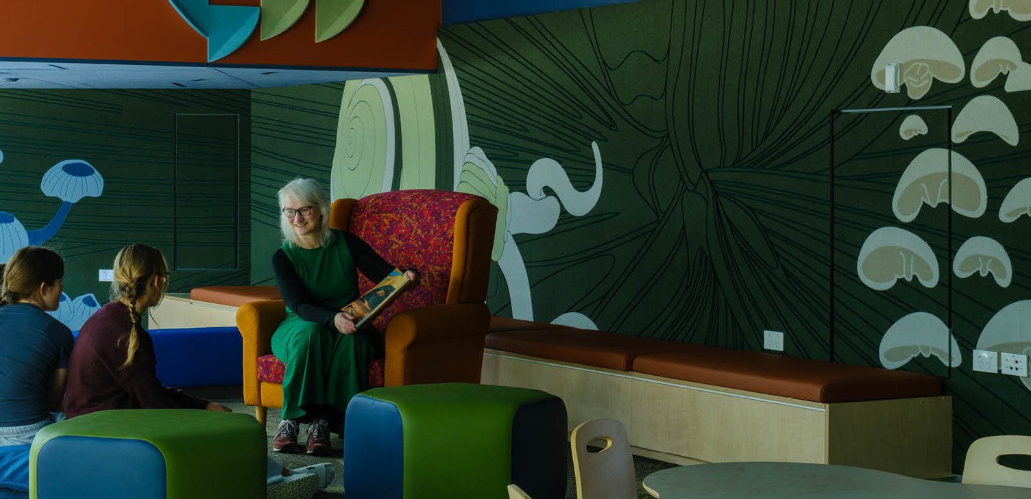
Drawing strong connections to nature, green is frequently used to create environments that feel balanced, restorative, and grounded. Soft, muted greens can support wellbeing and reduce visual fatigue, while richer greens add depth and character without overwhelming a space. Green works particularly well in education, healthcare, and workplace environments where designers are looking to strengthen a connection to nature or support occupant wellbeing.
Red
Red is one of the most energising colours in the spectrum and is often used to create impact, encourage interaction, or draw attention. While large applications can feel intense, muted reds, terracottas, and clay-inspired tones can introduce warmth and personality in a more refined way. Red is often most effective when used selectively, whether to highlight key destinations, create focal points, or bring energy to collaborative and social spaces.
Neutrals
Neutrals remain a cornerstone of commercial interior design, valued for their versatility, longevity, and ability to support a wide range of materials and finishes. Today’s neutral palettes have evolved beyond flat greys to include warmer greiges, stone-inspired tones, and textured finishes that add depth and visual interest. They provide a timeless foundation that allows feature colours, timber, metals, and architectural details to take centre stage while helping spaces feel comfortable, balanced, and enduring. Contemporary neutral schemes are often used to create environments that feel welcoming and human-centred without relying on bold colour statements.
Ultimately, colour shouldn’t be considered in isolation. The most successful interiors combine colour with materiality, texture, acoustics, lighting, and spatial planning to create environments that are not only visually compelling, but also support the people who use them every day.